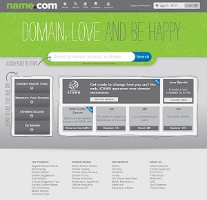
今天微魔打开Name的时候,忽然发现Name.com的界面居然换了,色调变成了草绿色+浅灰的搭配了,呵呵,倒是有点像微魔部落的样式了(我的模版颜色可能更深一些~)。刚刚突然记起Name前两天发的邮件,好像提起过这个茬儿,呵呵,顺便把原文po出来和大家共享吧~
|
Dear VMVPS,
How are you? We are writing to give you a heads up thatwe’re changing our look! The Internet has changed a lot since it’s early days, and so have we! Think about what you were doing 8 years ago:
Just as the Internet has changed and advanced, we have too. We’ve expanded to new digs in downtown Cherry Creek, Denver, with 25 employees, over 1 million domains under registration, and the most passionately loyal customer base a company could ever ask for. We all sat down together to answer questions like, ‘If Name.com was a person they would be…’ and as we defined ourselves as casual, clever, funny, innovative (the list goes on!), we realized our current style did not reflect the inventive, technologically progressive,wildly amazing company we see ourselves to be. |
| We’ve updated our look, and we’re pretty excited about it, and we hope you are too. |
| We know you love the Name.com orange, and we love it too, but we felt it was time for a serious update. We’re certainly not your average registrar, and feel our new design helps to communicate that better. We like to think of our brand as an ever-changing, living, breathing thing that is shaped by both our employees and community and will be constantly evolving. As we design, develop, and test new products we invite you to explore with us, help test out our new tools, and share your thoughts and feedback along the way. We’ve set up whatsup@name.com as a dedicated channel for customer feedback, so hit us up (we’re not robots, we actually listen)! You can also comment on our new look on Twitter using the hashtag #newname. |
|
What you can expect
|
| This is not just a skin-deep change, we’ve just spent 6+ months improving our back-end core so that we can build on top of it, providing you guys with the newest, fastest, best tools out there. Switching to the new brand will be an iterative process for us, so you’ll start to notice more pages flipping over to the updated style. Some pages, such as our search results and check out pages, will come with increased functionality, (don’t worry, our focus is still on simplicity) so we’d love to get your input as we redesign. We believe we are one of the most secure registrars in the industry and over the coming months we’ll be adding even more cool new security features to help keep your account and domains safe. We have a slew of new products in the pipeline including a super easy website builder (ah, finally!) an SEO tool, an iPhone app, and much, much more.We like the saying, “you shouldn’t judge a book by it’s cover” so with that in mind, please remember we are the same Name.com you know and love, we just look different. In fact, you can count on your experience with us reaching new heights. We’ll miss the orange, but we lovingly embrace the new green and all the thrilling changes that come with it. Cheers to us finally looking as good on the outside as we feel on the inside! |
| As always, thank you for choosing Name.com!
Sincerely, The Name Team |
这里顺便提供一下Name.com新版的一些图片吧,
下载地址:http://u.115.com/file/clt11a4vName.com.rar


